SimpleDirect & Vinci. One family.
SimpleDirect® is the company. Vinci names our AI models, tools, and research. The round mark identifies SimpleDirect; Vero leads the Vinci identity.

One company. A distinct AI identity.
SimpleDirect® is the company behind the work. The round mark sits beside its name.
Download SimpleDirect logo

Vinci is our family of AI models and tools. Vero gives it a recognizable face, alongside the Vinci name.
Download Vinci logo
Copy that's ready to paste.
Two descriptions of the lab you can quote directly — a short line and a fuller paragraph. Please keep the ® on the first, prominent mention of SimpleDirect®.
SimpleDirect® is an independent Canadian AI lab in Toronto. It builds AI models, tools, and products under the Vinci name.
SimpleDirect® is an independent Canadian AI lab in Toronto. It builds AI models, tools, and products under the Vinci name. Vero is the face of Vinci, helping people recognize and understand the work. Research records and model cards explain what has been tested and what remains unknown.



The Vinci character
Meet Vero
Vero is the face of Vinci, the AI models and tools built by SimpleDirect®. Use the compact pixel character in small spaces and the richer character in larger scenes.
SimpleDirect is the company; Vinci is the AI identity. Vero helps people recognize and understand the work. Test results come from our research records, not from a character’s expression. Model names remain Vinci.
The character layer of Vinci
More human. Just as rigorous.
Vero brings warmth and clarity to a technical world. Vinci remains the authority: the models, the tools, the research and the evidence behind them.
The institution
Strong typography, quiet layouts and precise language give the research room to speak.
The product world
Warm stone, pale sage and architectural light make abstract ideas tangible. Scenes are illustrations, not interface captures.
The character
Pixel Vero for small functional moments; richer Vero for selected editorial scenes. Character never replaces evidence.
Pixel Vero
For small logos, icons, and guidance.

Rich Vero / idle
For larger illustrations, explanations, and release images.
Approved states
These are illustrations of states, not live status indicators on this page. In a product, accompany them with the actual state, evidence and next action.
Waiting or at rest.

Activity, without a verdict.

Checking or human review.

A real condition prevents progress.

Completed activity; any verdict needs its own evidence.
Intensity by context
Keep character presence mild in product, medium in explanatory surfaces, and high only in campaigns, community and editorial contexts. Research and model evidence stay primary.
Size and clearspace
The delivered guide specifies no numerical minimum size. Use Pixel Vero for compact placements and Rich Vero at a size that keeps its face and details legible. Preserve proportions and leave generous clearspace.
Light and dark surfaces
Use the supplied dark wordmark on light backgrounds and light wordmark on dark backgrounds. Place the dark Pixel and Rich artwork on a light neutral surface for contrast. Do not recolour or invert the character.
Keep character and conclusion distinct
Do not redraw, stretch, recolour, add effects or invent poses. Keep the Vinci name with its identity; do not rename models around Vero. A “done” illustration must never imply a passed evaluation, safety, security, approval or certification without the supporting record.


Production assets
Unmodified SVG exports, with production-only versioned downloads. Editable designer files are not included. The complete download preserves the original Vinci kit.
One visual language. Different occasions.
Editable SVG compositions and ready-to-share PNGs in English and French. Keep the Vinci mark intact, let the headline lead, and use Vero selectively. Replace sample copy with verified release facts before publication.

Launch card
A large product name, three factual tags and a restrained workbench scene.
SVG · EN
Update card
A direct headline and a small character accent for a focused announcement.
SVG · EN
Philosophy card
A single thought, strong type and generous space.
SVG · EN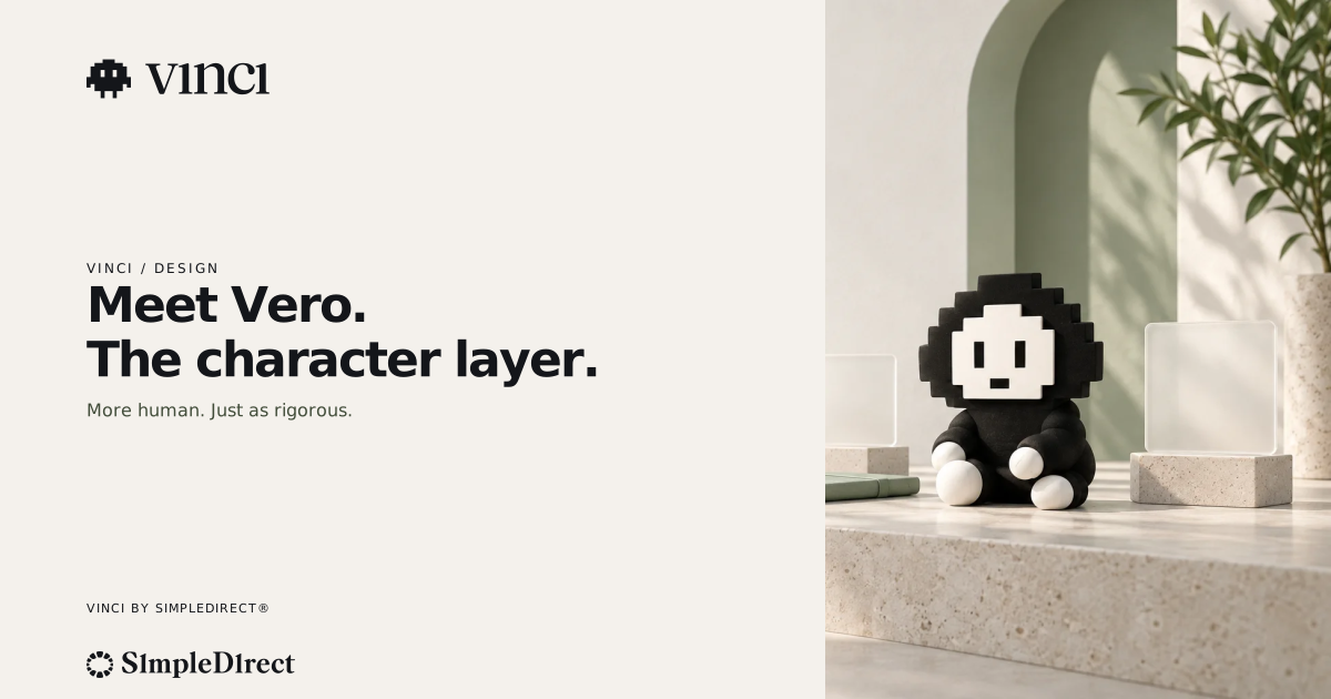
Article header
An editorial scene with room for the article’s central idea.
SVG · EN
Brand banner
Vinci leads; Vero adds atmosphere at the edge.
SVG · EN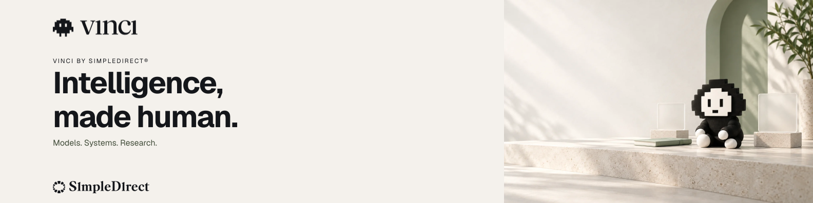

Social compositions
Vinci remains primary in these compositions of the official assets, sized for X, LinkedIn and link previews.

Every asset, one click away.
Original Vinci files and Vero artwork remain available below. The v1 kit preserves the earlier identity; use the website examples above for the new brand arrangement.
Vinci + Vero · Original kit
ZIP · Vinci + Vero · v1
Vector masters (SVG)


Raster exports (PNG)


Give the mark room.
Keep the symbol and name together as supplied. Leave space around each logo and use it large enough to read clearly.
Clearspace
Leave generous space around each logo. Keep nearby text and images outside that space.
Keep the name readable
Use the full logo when the name is needed. Check that both the name and symbol remain clear at the final size.
Use the right Vero
Use Pixel Vero in compact spaces and Rich Vero where there is room to see the details. Keep the supplied proportions.
Please don't do these.
The marks may be used to report on or reference Vinci, but not modified or used to imply endorsement. Six things to avoid:
Don't recolour or tint
Use the logo in its supplied colours only.
Don't add shadows
No drop shadows, glows, or bevels.
Don't add outlines
No strokes or outlines around the mark.
Don't stretch or distort
Scale proportionally — never squash or stretch it.
Don't rotate
Keep the logo level and upright.
Don't rebalance the mark & wordmark
Don't resize or reposition the mark and wordmark relative to each other.
Five colours, one accent.
Sage is the single brand accent. Everything else is warm neutral — ink and cream do most of the work.
The type system.
Geist is our everyday typeface. Geist Mono is for code and technical labels. Use the supplied logo artwork for the brand names.
How Vinci sounds.
Direct, specific, and anti-hype. We show honest trade-offs alongside the gains and never overclaim.
Taglines we use
- Made, not generated.
- Intelligence, made human.
- Open weights, open results.
- Warm enough to love. Credible enough to trust.
Voice principles
Direct
Say the thing plainly. No filler, no jargon for its own sake.
Specific
Concrete claims you can check — numbers, sources, and detail over adjectives.
Honest about trade-offs
We publish the trade-offs next to the gains, and never cherry-pick.
Writing about Vinci?
For interviews, quotes, or anything you can't find here, get in touch and we'll help you get it right.